
35 Best Movie Posters of All Time, Ranked
It might be easy to take them for granted sometimes, but posters can play a large role in both a film’s marketing before release, and a film’s status—iconic or otherwise—after release. A great poster doesn’t always equal a great movie, and there are plenty of very good movies that have forgettable posters. But some posters go above and beyond, and really stand out from the crowd, and it is admittedly often the case that being tied to a classic movie helps the poster (and vice versa).
Because there are more posters than movies out there (some titles have multiple/alternate posters, after all), it’s hard to properly address and pay tribute to all the great ones. As such, what follows intends to collect some of the greatest movie posters of all time and rank them, beginning with the great and ending with the greatest. With some exceptions, the following will tend to prioritize original posters for the movies in question, both for consistency’s sake and because, generally, you can’t beat the originals.
35. ‘Rosemary’s Baby’ (1968)
Poster by Philip Gips

Rosemary’s Baby is up there among the greatest movies of all time, and it’s especially worthy of classic status when it comes to looking at the horror genre more specifically. It’s a deliberately paced movie about a young woman who begins to have fears surrounding her recent pregnancy, and some of the strange ways her new neighbors have been acting around her.
The poster for Rosemary’s Baby expertly captures the sort of unease and dread inherent to the film, with that murky green color already inspiring a faint sense of nausea. The titular Rosemary looks catatonic (or maybe even dead) in the background, and then there’s the baby carriage silhouetted in front of her, though it’s unnervingly too far away, and too dark, to see what’s in there. On a very primal level, the poster serves to make you know more or less what kind of horror you’re in for, should you choose to watch Rosemary’s Baby.
34. ‘Fargo’ (1996)
Directed by Joel Coen

Inspiring a TV series of the same name, and itself being one of the best movies of the 1990s, Fargo sees the Coen brothers at their very best. It tells a dark and sometimes funny story about a criminal scheme that spirals disastrously out of control, with everyone dooming themselves more and more with every passing scene. Eventually, everyone’s put out of their misery when a police officer swoops in and pretty much single-handedly saves the day.
It’s not what happens, but how it happens, that makes Fargo great. As for the poster, it’s eye-catching without being overly flashy. It evokes a sense of comfort and warmth while also contrasting that with coldness (the color white standing in for snow) and violence. And that’s in line with the energy of the film; it’s fun and surprisingly easy to watch, but it’s not without its grim and grisly moments, either.

33. ‘Dial M for Murder’ (1954)
Poster by Bill Gold

As you might guess from the title, Dial M for Murder gets pretty dark, even by Alfred Hitchcock’s standards. It sees him very much in his wheelhouse, directing a polished and suspenseful crime/thriller that still holds up. But for as good as the film is, its poster might be even better, and not just because it visually represents what would have to be the movie’s most memorable sequence.
It matches the title perfectly, and the bright red contrasting with the blond hair? That’s unfiltered Hitchcock right there, just in an image. Dial M for Murder’s poster foreshadows the sort of thriller this is: bold visually, high-stakes, and unafraid to deal with, you know, murder. The title itself also does some of the heavy lifting, because it’s a catchy one, and it feels good to say.

- Release Date
-
May 29, 1954
- Runtime
-
105 minutes
-

Grace Kelly
Margot Wendice
-
-
Robert Cummings
Mark Halliday
-
John Williams
Chief Inspector Hubbard

Poster by John Alvin

Good old E.T. the Extra-Terrestrial, you know? It’s widely beloved, and one of Steven Spielberg’s very best films, but it’s so well-known and celebrated that it’s possible to take it for granted. It’s seemingly always been there, at least if you’re under a certain age, holding up as one of those movies that inspires intense emotions regardless of how old you are when you watch (or revisit) it.
And, at the risk of sounding like a broken record, the magic captured in the film is similarly there in the poster. The silhouette of a bike flying against the moon is the most striking image of E.T. the Extra-Terrestrial, and so repurposing it for the poster was a no-brainer. There’s that sense of wonder and adventure there that you get in the film itself, and the image also promises something out of the ordinary, which the film, of course, delivers in spades.
31. ‘Chinatown’ (1974)
Poster by Jim Pearsall

Chinatown is a pitch-perfect film noir throwback/update, telling a thrilling story within a period setting. It goes back to the 1930s, evoking that time well but, at the same time, also forwarding certain noir tropes and conventions, twisting that whole film movement into something even darker and more intense than noir films of old.
The poster, in turn, has certain noir-ish qualities to it (especially all the smoke and the outfit Jack Nicholson’s character is depicted wearing), but then there are some odd additions that give it an almost surreal feel; namely, that face looming in the background. It’s bright and visually striking, but also conveys a more than slight sense of unease, emphasizing darkness while also being colorful… which can also be said about Chinatown’s imagery, and the way it contrasts, at times, with the exceptionally dark story at hand.

30. ‘Brazil’ (1985)
Poster by Bill Garland

Brazil is a particularly dark piece of science fiction, with a protagonist who battles bureaucracy on a daily basis while escaping into fantasy worlds. Eventually, things get a good deal more complicated, and the movie itself goes kind of mad. Reality collapses, potential conspiracies are revealed, and viewers will likely become exhausted… but in a good way. That’s kind of the point and all.
The poster for Brazil does a good job of communicating some of this. The wings and suit of armor are shown in some of the dream sequences the protagonist has, and the huge number of drawers going into the background foreshadows the futile battle against overwhelming bureaucratic nonsense. It also looks striking and eye-catching like any good poster needs to, and the font/use of pink for the title is also a bold choice that pays off.

29. ‘Eyes Without a Face’ (1960)
Directed by Georges Franju

If you’re after a somewhat unconventional horror/thriller film, something like Eyes Without a Face should scratch the itch. Despite its age, it’s still genuinely quite unnerving and continually eerie, telling the story of a man driven mad after causing an accident that leaves his daughter’s face severely disfigured. For much of the film, she has the appearance of the startling figure on the poster, wearing a mask that covers everything but her eyes.
The horror comes in thanks to the fact that the father kidnaps other girls and tries to remove their faces so he can restore his daughter’s looks, with unsettling suspense sequences and tragedy ensuing. It’s a film with a good reputation, but it almost doesn’t need it when Eyes Without a Face has such a notably creepy poster; one that, once seen with your eyes (with or without face), proves hard to forget.
28. ‘Amadeus’ (1984)
Poster by Peter Sís

Though Amadeus is technically a Best Picture-winning historical/biographical film, it doesn’t entirely focus on historical accuracy throughout. Instead, it retells events relating to the lives of Wolfgang Amadeus Mozart and Antonio Salieri, suggesting the pair had a rivalry of a mostly one-sided nature, and that the latter played a part in the tragedy that befell the former.
It is a grand and rather theatrical film, with a runtime of about 160 minutes or approximately three hours, depending on which cut you watch. The emotions it deals with are broad and dramatic; jealousy plays a huge part, as does the drive to create perfect art and make a legacy for oneself. The figure on the poster of Amadeus references a mask worn at a handful of points in the film (by a couple of different characters), but it plus the figure wearing it look both ominous and almost beckoning on the poster. The poster works to capture both the film’s epic qualities and its rather dark, sinister story.

27. ‘The Evil Dead’ (1981)
Directed by Sam Raimi

The Evil Dead gets pretty gory and intense at times, with the poster hinting at such things in a way that’s tasteful by horror movie poster standards. There’s not much to it except a young woman struggling in what looks like a desolate space, seemingly half-buried and being pulled further downwards by a hand that wants her to be fully buried. The imagery does also hint, somewhat, at what has ended up being The Evil Dead‘s most controversial scene.
Then, you watch the film, and it is indeed about not one, but several young people who are forced to survive against demons while staying at a cabin in the woods. The blueness of the poster does establish the relatively dark and dingy feel of The Evil Dead, but notably leaves out the color red, in turn making it more of a surprise when the film turns out to be as gruesome and blood-drenched as B-movies get.
26. ‘Beau Travail’ (1999)
Directed by Claire Denis

There are almost too many great movies from 1999 to count, with Beau Travail being one of the best, albeit one that’s overshadowed to some extent by the more mass-appealing blockbusters of that year. In contrast, Beau Travail is very much an arthouse affair, playing out like a slow, contemplative, and character-focused film about an officer in the French Foreign Legion having some complex feelings about a new recruit.
Beau Travail explores masculinity, repressed feelings, and identity in a way that feels brutally honest and sometimes quite mysterious. There’s a lot that can be read from the film, but it doesn’t always make things obvious, in typical arthouse fashion. The poster is appropriately suggestive of the blank slate approach, asking one to place meaning on what might at first be bare. It also catches the eye, and the lack of a discernible face represents how many of the male characters in the film hide their emotions, and keep their faces blank in a way that’s only slightly less literal.

- Release Date
-
May 3, 2000
- Runtime
-
92 Minutes
-
-
Michel Subor
Commander Bruno Forestier
-
Grégoire Colin
Gilles Sentain
-
25. ‘Jaws’ (1975)
Poster by Roger Kastel

There are plenty of great “man vs. creature” movies out there, but few resonate quite like the original Jaws. This was the film that made Steven Spielberg a household name, and arguably kicked off the idea of what a blockbuster movie was. The plot’s simplicity was one of its greatest strengths, with three men going on a deadly mission to kill a giant shark that had been terrorizing their coastal town. The straightforward nature of Jaws’ premise is reflected beautifully in its instantly striking poster.
Well, the title helps as well, and on the poster in question, those four letters spelling out a single word appear bold against a white background, the color of the letters blood-red. Below the title swims a single figure, and below the swimmer looms a considerably larger shark barreling straight towards her. It encapsulates the film’s opening sequence perfectly, and given that sequence establishes the tone for the entire movie perfectly, it’s pretty easy to call the poster for Jaws essentially perfect.

24. ‘Apocalypse Now’ (1979)
Poster by Bob Peak

Few filmmakers have ever had as great a decade as Francis Ford Coppola did in the 1970s. Between 1972 and 1974, three movies of his were released, with two winning Best Picture at the Oscars—The Godfather (1972) and The Godfather: Part II (1974), and the other, 1974’s The Conversation—winning the Palme d’Or at Cannes. Anticipation was naturally high to see how his next film, Apocalypse Now, would turn out, so it probably didn’t even need a poster to help with that anticipation.
Still, Apocalypse Now nevertheless had an eye-catching one that suits the nightmarish, surreal, and oftentimes violent nature of the film itself. There are a couple of well-recognized posters for the film, owing to its multiple re-releases and re-edits, but they’re generally characterized by a shot of helicopters silhouetted against an orange or red sun, with some adding in the ominous faces of protagonist Captain Willard (Martin Sheen) and antagonist Colonel Kurtz (Marlon Brando) for good measure.
23. ‘Badlands’ (1973)
Directed by Terrence Malick

Condensing the essence of a Terrence Malick film into a single poster would be a daunting task, especially if one wanted to do something other than simply feature a beautiful frame from the film in question with some text superimposed over it. Given how beautiful and dreamlike Malick’s films are, such an approach would still work well, but it’s always good to see something like the distinctive poster for Badlands—Malick’s feature debut as a director—try something different and succeed.
Badlands is a movie about a young couple going on the run from the law after a murder, in the process committing more… but unlike Bonnie and Clyde, it’s only the man (Martin Sheen) who does the real criminal stuff, and not the young woman (Sissy Spacek). The dynamic is reflected in the poster, which also looks visually bold and emblematic of the film’s overall look without being a specific frame from Badlands. It’s regrettably difficult to find the name of the person responsible for this poster (it seems to happen sometimes, perhaps speaking to how under-appreciated poster illustrators/designers are), but it’s nevertheless a great one worth singling out.

22. ‘Scarface’ (1983)
Poster by John Alvin

Look, most of the time, when a poster simply lists the title, the name of the lead actor, and an image of said actor, it can get the job done without being too remarkable. For as iconic as The Godfather is, its poster—which still looks good—is simply a shot from the film emphasizing Marlon Brando, telling potential audience members that there’s a crime movie with Brando in it (that’s probably enough for some). But when it comes to something like Scarface‘s poster, you have to appreciate the extra effort.
It’s the stylization that’s everything with the poster for Scarface, with its use of black and white for the image and bold red text for the title and name of its lead actor: the legendary Al Pacino. There’s a reason this poster is one of those definitive ones forever tied with college dorms, but beyond it being a movie often loved by young film buffs, it is also just a fantastically designed poster. It says to you: “Al Pacino is in this, he has a cool name, and he has a gun. You should watch this.” And you’ll probably internally reply: “Okay.”

21. ‘King Kong’ (1933)
Poster by Glenn Cravath

It’s wild to think that King Kong has been a series for more than nine decades at this point, with the original classic film featuring the giant ape coming out in 1933. This was a decade when posters were generally pretty straightforward, and tended to rely on simply showing headshots of the actors who’d appear, and many of them were kind of cluttered/text-heavy, too. This does help the poster for King Kong stand out, which feels a little more stylized and overall unique.
The King Kong poster featuring the titular character atop the Empire State Building may effectively give away the film’s bold climax, but it definitely leaves an impression. It’s taller than most posters in a way that serves to emphasize Kong’s size, as well as how high up he is, with the poster also highlighting his conflict with humanity and his strange love for a young woman named Ann (Fay Wray). It’s a timeless movie, and thereby it’s fitting that it has a timeless poster that still holds up.

20. ‘La Dolce Vita’ (1960)
Poster by Giorgio Olivetti

La Dolce Vita may be one of the best movies of the 1960s, but it could also be one of the hardest from that decade to effectively summarize. It’s a movie that goes for almost three hours, and is distinctively episodic in structure, with the central character being a detached journalist who travels around Rome, constantly seeking a good scoop and perhaps, one day, true love. It doesn’t have a clear and easily defined narrative, so summing up all La Dolce Vita has to offer on a single poster might’ve been challenging.
Giorgio Olivetti instead opted to focus on just one segment of the epic-length La Dolce Vita: the iconic scenes featuring Anita Ekberg as Sylvia, a Swedish-American actress visiting Rome. She does end up stealing the film, thanks to her charisma and beauty, and so she’s prominently featured on the poster for the film, with the protagonist—played by Marcello Mastroianni—appearing in the shadows behind her. It’s simple and eye-catching, and though it can only highlight one of the film’s numerous segments, it undoubtedly highlights it well.

- Release Date
-
April 19, 1961
- Runtime
-
174 Minutes
-
Marcello Mastroianni
Sylvia
-
Anita Ekberg
Marcello Rubini
-
-
19. ‘Pulp Fiction’ (1994)
Poster by James Verdesoto

Quentin Tarantino has made a career out of making stylish, unique, and oftentimes darkly funny movies, with 1994’s Pulp Fiction being arguably his most iconic and widely loved. It’s a crime movie that blends several different storylines together, with these being told out of chronological order while occasionally overlapping, all serving as loving homages to pulp magazines and old-school crime novels/films, hence the title.
The poster of Pulp Fiction also feels like it specifically homages such stories from decades past, with it being designed to look as though it could be the cover of a related book. Uma Thurman’s character—the only one shown on the poster—is also reading what looks like a magazine that shares the movie’s name, in essence highlighting the meta/referential nature of the film itself. It’s a great film with a great poster, though it’s been the subject of some controversy, with Firooz Zahedi claiming he should be credited instead of James Verdesoto.

18. ‘Breakfast at Tiffany’s’ (1961)
Poster by Robert McGinnis

While Breakfast at Tiffany’s is a movie that hasn’t aged perfectly by any means, its poster has held up considerably well, remaining eye-catching and bold more than 60 years on from the film’s release. It’s a movie that’s all about Audrey Hepburn, and how stylish she could be, which is why she’s front and center on the poster. The core design of the poster largely remains the same, though some also highlight the film’s romance elements by having the main couple embracing in the background.
Either way, the key takeaway from Breakfast at Tiffany’s’ poster is that Hepburn is in the movie, she will look timelessly beautiful, and a cute cat will also be featured. It sells the movie pretty well, all things considered, and its charm is matched by the elements of the film that are still compelling—some of the humor, the romance, and the fashion. As for the things in Breakfast at Tiffany’s that are less than great… well, they’re not on the poster, so they can be ignored until you actually watch the movie (a Mickey Rooney-free re-edit would honestly go a long way to making the film better).
17. ‘2001: A Space Odyssey’ (1968)
Poster by Robert McCall

Stanley Kubrick‘s stellar filmography is complemented by numerous eye-catching and iconic posters, with 2001: A Space Odyssey being both one of his greatest films and having one of the best posters within said filmography. The film is a space exploration/sci-fi movie which most others released in its wake are compared to, though its ambition is often unmatched, given it spans an immense amount of time and aims to convey various stages of human evolution in under 2.5 hours.
Despite its forward-thinking qualities, it somehow feels fitting that the poster for 2001: A Space Odyssey feels a little more old-school, with an illustration of one of the film’s most iconic images: that of Space Station 5. It perfectly captures the magnitude and ambition of the film it’s attached to, and looks just as striking as the memorable sequence it serves as a representation of. The poster works as an awe-inspiring piece of art that nevertheless only shows a glimpse of all the sights found within Kubrick’s sci-fi epic.
16. ‘Rocky’ (1976)
Directed by John G. Avildsen

There are a couple of similar posters often seen for the original Rocky, with the variations making it difficult to track down one person who can be given credit for them. Stylistically, they’re similar to the aforementioned Scarface poster, making use of striking black and white colors and bold text up the top. One well-known variation depicts a silhouette of Rocky Balboa and love interest Adrian holding hands, while the arguably better-known version has him standing atop the staircase to the Philadelphia Museum of Art.
This latter poster utilizes the same strategy as the La Dolce Vita poster, emphasizing one of the film’s most iconic elements in a visually distinct and eye-catching way. And the simplicity works, partly because Rocky is a fairly simple yet utterly satisfying underdog sports movie, with the titular character appearing triumphant in the poster, even if he’s shown to be a relatively small part of said poster. The image suggests he’s standing up to the world, in a sense, and striving to defy the odds, which is indeed what he aims to do throughout the movie itself.

15. ‘The Thing’ (1982)
Poster by Drew Struzan

The Thing is a terrifying and very violent R-rated horror movie, with its poster helping to imply the former without suggesting the latter, perhaps helping its more gruesome scenes to have a greater impact within the actual film. The 1980s classic combines body horror with eerie sci-fi elements to perfect effect, having a story that centers on a group of researchers in Antarctica fighting for their lives after coming into contact with a vicious and shape-shifting alien creature.
Beyond the gore, much of the terror in The Thing comes from the fact that the antagonist can almost perfectly mimic human beings and therefore blend in, which is reflected exceptionally well in the poster. Just who the ominous-looking person is on the poster isn’t clear, with their identity entirely obscured by what seems to be a blinding white light. It’s not a scene that happens in the film by any means, but it encapsulates both the paranoia and nail-biting suspense of The Thing perfectly.

14. ‘Sullivan’s Travels’ (1941)
Poster by Maurice Kallis

One of the best releases of the 1940s, Sullivan’s Travels nonetheless might still represent one of those rare instances where the poster is even better than the movie it’s attached to. The film is about a movie director named John L. Sullivan (played by Joel McCrea) deliberately living life as someone without a home or other possessions in the hope that it’ll inspire him to make better, more authentic films, though the poster emphasizes a character known only “The Girl,” played by Veronica Lake.
Lake had a relatively brief career in Hollywood, and an ultimately tragic life, though she was a big name in the early 1940s and was well-known for her iconic “peek-a-boo” hairstyle. The illustration of her likeness on the poster for Sullivan’s Travels certainly catches the eye, with its bold yellow background and tagline also playing a part. It’s a poster that keeps things simple and utilizes Lake’s star power at the time well.

Sullivan’s Travels
Hollywood director John L. Sullivan sets out to experience life as a homeless person in order to gain relevant life experience for his next movie.
- Release Date
-
December 29, 1941
- Run Time
-
90 minutes
13. ‘Halloween’ (1978)
Poster by Robert Gleason

While it could sound like a bold claim, it may well be the case that horror movies tend to have more iconic posters than any other genre of movies out there. That’s not to say all horror movie posters are automatically great or even good, but there are countless beloved ones. The blunt, strong emotion-heavy nature of the horror genre just translates well to bold, memorable images placed on posters, and the wonderful straightforwardness of the original Halloween‘s poster, for example, demonstrates this excellently.
A slasher movie classic that helped establish John Carpenter as a great director and Jamie Lee Curtis as a star, Halloween is all about a dangerous individual breaking out of a psychiatric hospital and going on a murderous rampage during the titular holiday. The poster uses one of the most recognizable icons of Halloween—a jack-o’-lantern—and pairs it with a hand holding a knife, all against a pitch-black background. The title’s Halloween, there’s a carved pumpkin, and a scary-looking knife. What more do you need to know?

12. ‘Anatomy of a Murder’ (1959)
Poster by Saul Bass

Saul Bass is a name you’ll see pop up quite often while looking over memorable and widely praised movie posters. Bass also designed title sequences for films and made corporate logos, too, and while he might not have designed as many posters as you’d expect, his unmistakable style has proved extremely influential. He designed his first movie posters in the 1950s, with one of his greatest early works being for the acclaimed 1959 courtroom drama/thriller Anatomy of a Murder.
Bass could always boil down a movie’s overall mood or feeling to its bare essentials, and represent it with seemingly simple silhouette figures and a limited color palette. Anatomy of a Murder‘s poster looks simple at first, but the figure it depicts is made up of various pieces, suggesting the film will be intricately made and also likely mysterious, given the lack of information present in the poster. It’s hard to put into words why it works to catch the eye, but it undoubtedly does, and is one of Bass’s best efforts.

Anatomy of a Murder
- Release Date
-
July 1, 1959
- Runtime
-
161 minutes
11. ‘The Fly’ (1986)
Poster by Richard Mahon

Science fiction doesn’t get much scarier than it does in The Fly, which is a movie all about a science experiment gone horribly wrong. It stars Jeff Goldblum as a scientist named Seth Brundle, and the film begins with him showing a journalist (played by Geena Davis) how he’s on the cusp of creating a device that can teleport objects and living things. Regrettably, when he decides to eventually test the machine on himself, things take a turn for the worse.
The Fly shows Brundle’s slow transformation from a human to a fly-like creature, with each scene more terrifying and grotesque than the last. It’s another horror movie with a simple yet striking poster, being a summation of how Brundle is part-man, part-fly for much of the film, though obscuring too much detail. It captures the tone of the movie well, while also depicting in a plain and straightforward manner just what’s going to go down, and stands as an amazing horror film poster as a result.

10. ‘Mean Streets’ (1973)
Directed by Martin Scorsese

Martin Scorsese’s first true cinematic dip into the crime and gangster genre came in 1973, with the release of Mean Streets, a film many would point to as his first great one. Its plot is de-emphasized, as it’s really more of a hang-out movie following a bunch of young men who all dream of being well-established, well-connected gangsters one day. The title, Mean Streets, establishes the violence and urban location of the film, as does the film’s simple and effective poster.
A hand holds a smoking gun in the foreground, effectively merging in with the buildings in the background. Violence is directly within the city, and on the streets—the visual metaphor is blunt, but it also works fantastically well. Violence in New York City is something Scorsese would explore plenty more times in his career (particularly in 1976’s Taxi Driver and 2002’s Gangs of New York), but never would one of his New York-set movies have quite as good a poster as Mean Streets did.

9. ‘West Side Story’ (1961)
Poster by Joe Caroff

While some may debate whether Steven Spielberg’s 2021 reimagining of West Side Story or the 1961 film version was better, there’s a pretty clear winner when it comes to which one had the best poster. 1961’s West Side Story is simpler, more striking, and ultimately more iconic, its red background hinting at the intensity and violent storyline of the film while the stairs used evoke the film’s setting and a pair of people strike a pose on them.
This Best Picture-winning musical had its opening titles (and closing credits) designed by the aforementioned Saul Bass, but when it comes to West Side Story’s poster, it was done by Joe Caroff. Still, it feels reminiscent of the sorts of posters Bass had already made by the early 1960s, so perhaps Caroff took some fairly direct inspiration from them (or could well have been designed after Bass had already contributed to the film in the ways he did).
8. ‘The Silence of the Lambs’ (1991)
Poster by Dawn Baillie

A Best Picture-winning crime/horror/thriller film that stars Anthony Hopkins at his most iconic and an equally memorable Jodie Foster, The Silence of the Lambs is an undisputed classic. It’s an unsettling and consistently suspenseful ride, and has a narrative that follows a young FBI agent getting help from an imprisoned serial killer/cannibal to track down another dangerous murderer who’s at large.
The Silence of the Lambs had the sort of star power and buzz behind it that would’ve made it easy to market even if its poster hadn’t been anything to write home about, but thankfully, its poster also happened to be excellent. It’s evocative and fits the mood of the film without giving away anything, really, regarding what the film is about. Still, the image is hard to forget, even if it’s less connected to the film at large than most great posters out there. It gets even more frightening when you realize there’s a skull on the moth, and then notice what the skull’s made out of.
7. ‘Gone with the Wind’ (1939)
Re-release poster by Howard Terpning

The epic, classic, and controversial war/romance/drama film that is Gone with the Wind had a relatively standard poster upon its original theatrical release, but got a more striking one when the film was re-released to theaters in 1967. That updated poster was designed by Howard Terpning, and it’s since trumped the original poster in popularity (which isn’t a bad one, by any means, but it hardly screams “iconic” or anything).
The fiery, passionate, and melodramatic romance and spectacle on offer throughout all 233 minutes of Gone with the Wind is summarized succinctly on its poster. The fire seen in the background sums up both the wartime drama and the passionate, sometimes even violent romance at its center, with Golden Age of Hollywood stars Vivien Leigh and Clark Gable dominating much of the poster’s space. It’s not subtle, but neither is the movie, and as a poster, it’s a difficult image to forget.
6. ‘The Shining’ (1980)
Poster by Saul Bass

One of the final posters Saul Bass ever designed was for Stanley Kubrick’s The Shining, with this iconic supernatural thriller/horror film also standing as the third-last film Kubrick ever directed. For both creative minds, they did some of their best work for this film, with The Shining—as a film—being an endlessly creepy watch that combines both psychological and supernatural horror, and the poster for The Shining being eerie, simple, and honestly just uncomfortable to look at for too long at a time.
The poster may be simple, but the process of designing it reportedly wasn’t, with numerous designs swapped back and forth between Kubrick and Bass until one was finally finalized. Perhaps the end result was worth it, because while the alternate poster for The Shining—a close-up of Jack Nicholson’s face grinning menacingly—can also get the job done, it’s definitely not as evocative as the yellow and almost indecipherable Saul Bass one.


5. ‘Blade Runner’ (1982)
Poster by John Alvin

Classic 1980s movies don’t get much better than Blade Runner, and similarly, posters from that era don’t get much better than Blade Runner’s original poster. It was created by John Alvin, who’s been behind plenty of classic film posters, including the aforementioned Scarface poster. Blade Runner might be his best, though, with the film’s two lead characters contrasting against an unofficial main character of Blade Runner: the alternate, moody, and “futuristic” Los Angeles of 2019.
The lighting, prominent weapons, and cigarette being smoked all point to Blade Runner’s status as a neo-noir movie; one that blends film noir conventions with a modern—and sometimes futuristic—sheen. It’s a poster that’s illustrated in that distinctly ’80s style that just feels extra evocative now, and certainly nostalgic, too. In a good way, it could’ve only really been attached to a movie that came out in said decade, and it makes sense that such a classic film has such a classic poster.
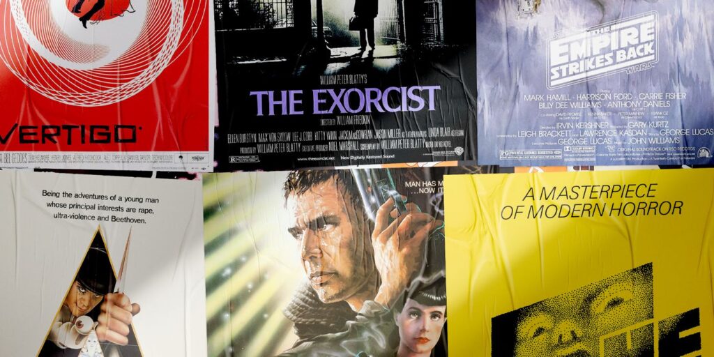
4. ‘A Clockwork Orange’ (1971)
Poster by Bill Gold

One final big-name poster designer worth highlighting is Bill Gold, who began designing film posters in the early 1940s, and made his final one in 2011, for the Clint Eastwood-directed J. Edgar. Some of his best and most iconic work came in the 1970s, and got attached to some of that groundbreaking decade’s most groundbreaking films. Case in point: the creepy, stark, and perhaps even dangerous-looking poster for A Clockwork Orange.
The film blends satire, sci-fi, and distressingly violent crime into one harrowing and thought-provoking movie about lawlessness, justice, and the way the State can control its population. The lofty ideas and themes of such a film can’t entirely be conveyed on a single poster, but you definitely get hints of the film’s controversial violent and sexual content through the imagery used. Further, the black triangle contrasting with the white background could work to foreshadow some of the film’s visuals, or perhaps reflect a sense of “black vs. white” morality that then gets discussed, deconstructed, and even obfuscated throughout A Clockwork Orange‘s runtime.
3. ‘Star Wars: The Empire Strikes Back’ (1980)
Poster by Roger Kastel

1977’s Star Wars may have blown people’s minds upon release, but its acclaimed 1980 sequel, The Empire Strikes Back, was the one that ultimately shattered any and all expectations. Things got darker for the main characters after their victory against the Empire at the end of the first Star Wars, and if anything, said Empire “striking back”—as suggested by the title—is kind of underselling it.
The Empire Strikes Back kicks off with Rebel forces being crushed in battle and then scattered across the galaxy, leading Luke Skywalker to seek training while Han Solo and Leia—among others—flee the Empire forces. It’s a non-stop thrill ride through space, and the poster features glimpses of numerous “greatest hits” throughout the film: romance, space battles, a snowy setting, and Darth Vader’s helmet looming ominously over all. It might be up for debate which of the Star Wars posters truly is the best-looking, but The Empire Strikes Back’s would have to be a contender.
2. ‘The Exorcist’ (1973)
Poster by Bill Gold

Two years on from designing the poster for A Clockwork Orange, Bill Gold also designed the poster for another classic from the 1970s: The Exorcist. This original Exorcist film is easily the series’ best, and also stands as a high point within the vast and impressive filmography of the late William Friedkin. The story is simple but powerful: there’s a young girl who is exhibiting strange behavior, and her mother becomes desperate enough to believe an exorcism is the only thing that could help.
One of The Exorcist’s best images—that of a priest standing silhouetted against an ominous house filled with terror—is used for the poster, and made to appear even more eerie than it does in the film. It’s a great approach for a horror movie poster to take, almost as if the film is daring you to watch it the same way the light is almost “beckoning” or daring the priest to enter. Movies don’t get much scarier or more striking, and neither do movie posters, for that matter.

1. ‘Vertigo’ (1958)
Poster by Saul Bass

Vertigo is a movie that’s endlessly praised and held up as one of Alfred Hitchcock’s very best, and it’s easy to see why. It was a bold and extremely dark film for its time, with its heavy thematic content, introspective nature (for Hitchcock, mirroring obsessions and desires of his own, if you want to read into it), and amazing visuals all adding up to make it an all-time great film of the 1950s. Vertigo was also lucky enough to have Saul Bass design the poster and opening titles, and he did remarkable work in both areas.
Fittingly, Vertigo’s opening titles mirror its poster, with both utilizing a disorienting spiral that looks as though it never ends and could swallow something—or someone—whole. As a visual representation of the protagonist’s acrophobia, as well as an ominous foreshadowing of the spinning, uneasy, and absorbing psychological thriller to come, such iconography works wonders. Vertigo’s poster is striking and uncluttered, yet perfectly encapsulates much of the film while saying a surprisingly large amount about it. It also just looks really, really cool, with all this ensuring that Vertigo’s poster could indeed be called the greatest in cinematic history.